<<chapter 4>>
RESPECTFULLY, YOURS 👵🏼
<<chapter 4>>
RESPECTFULLY, YOURS 👵🏼
<<chapter 4>>
RESPECTFULLY, YOURS 👵🏼
<<client>>
ashley {F/W 2026 CAMPAIGN} /spec
<<sow>>
/creative-direction, /art-direction, /ooh, /copywriting
<<client>>
ashley {F/W 2026 CAMPAIGN} /spec
<<sow>>
/creative-direction, /art-direction, /ooh, /copywriting
<<client>>
ashley {F/W 2026 CAMPAIGN} /spec
<<sow>>
/creative-direction, /art-direction, /ooh, /copywriting
<<goal>>
to reposition Ashley in the cultural imagination — by addressing its past head-on and rewriting its narrative
<<goal>>
to reposition Ashley in the cultural imagination — by addressing its past head-on and rewriting its narrative
<<goal>>
to reposition Ashley in the cultural imagination — by addressing its past head-on and rewriting its narrative

STRATEGIC INSIGHT:
Ashley had history. Comfort. Familiarity. But it also had baggage. This campaign became a love letter and a farewell note — thanking the past while boldly stepping into the future.
STRATEGIC INSIGHT:
Ashley had history. Comfort. Familiarity. But it also had baggage. This campaign became a love letter and a farewell note — thanking the past while boldly stepping into the future.
STRATEGIC INSIGHT:
Ashley had history. Comfort. Familiarity. But it also had baggage. This campaign became a love letter and a farewell note — thanking the past while boldly stepping into the future.
APPROACH:
Framed as a stylish, self-aware “goodbye to the old Ashley,” the campaign leaned into clever copy and nostalgic references. It winked at the brand’s outdated associations — lace doilies, plastic-covered couches, grandma-core — and made it clear: Ashley had glowed up.
APPROACH:
Framed as a stylish, self-aware “goodbye to the old Ashley,” the campaign leaned into clever copy and nostalgic references. It winked at the brand’s outdated associations — lace doilies, plastic-covered couches, grandma-core — and made it clear: Ashley had glowed up.
APPROACH:
Framed as a stylish, self-aware “goodbye to the old Ashley,” the campaign leaned into clever copy and nostalgic references. It winked at the brand’s outdated associations — lace doilies, plastic-covered couches, grandma-core — and made it clear: Ashley had glowed up.
/CREATIVE-CONCEPT:
/CREATIVE-CONCEPT:
/CREATIVE-CONCEPT:
<<campaign>>
RESPECTFULLY, YOURS 👵🏼
A graceful departure from the outdated version of the brand. It honored what Ashley meant to previous generations, while reclaiming its voice with editorial polish and cultural relevance.
<<campaign>>
RESPECTFULLY, YOURS 👵🏼
A graceful departure from the outdated version of the brand. It honored what Ashley meant to previous generations, while reclaiming its voice with editorial polish and cultural relevance.
<<campaign>>
RESPECTFULLY, YOURS 👵🏼
A graceful departure from the outdated version of the brand. It honored what Ashley meant to previous generations, while reclaiming its voice with editorial polish and cultural relevance.


>>TONE OF VOICE:
/reflective, /culturally-aware, /poetic, /warm, /stylish, /honest, /nostalgic, /boldly-emotional
>>TONE OF VOICE:
/reflective, /culturally-aware, /poetic, /warm, /stylish, /honest, /nostalgic, /boldly-emotional
>>TONE OF VOICE:
/reflective, /culturally-aware, /poetic, /warm, /stylish, /honest, /nostalgic, /boldly-emotional
>>ART DIRECTION:
Art direction drew from vintage visual cues — warm textures, soft light, classic silhouettes — but reimagined them through a modern editorial lens. Spaces felt lived-in, layered, and deeply intentional.
>>ART DIRECTION:
Art direction drew from vintage visual cues — warm textures, soft light, classic silhouettes — but reimagined them through a modern editorial lens. Spaces felt lived-in, layered, and deeply intentional.
>>ART DIRECTION:
Art direction drew from vintage visual cues — warm textures, soft light, classic silhouettes — but reimagined them through a modern editorial lens. Spaces felt lived-in, layered, and deeply intentional.
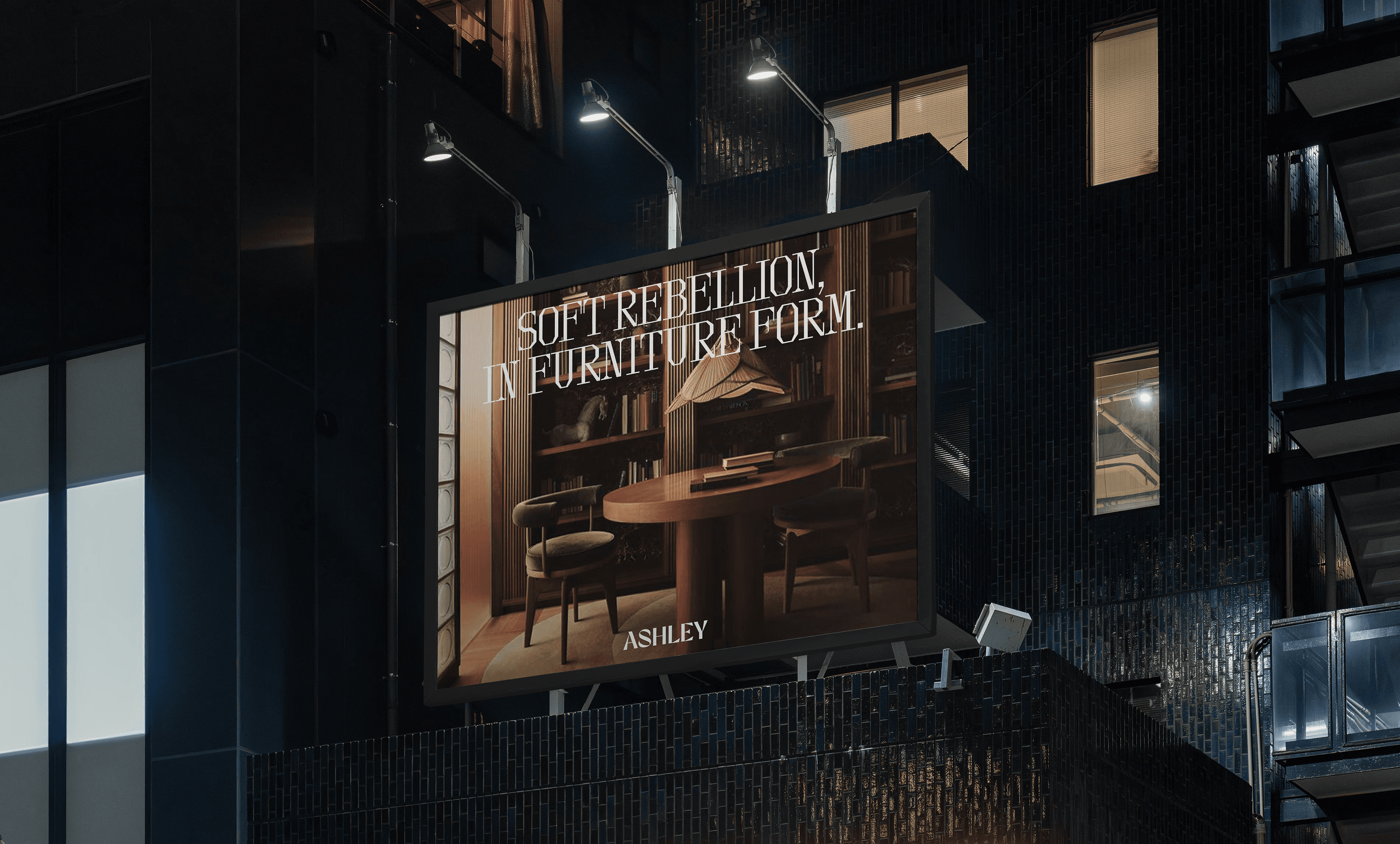
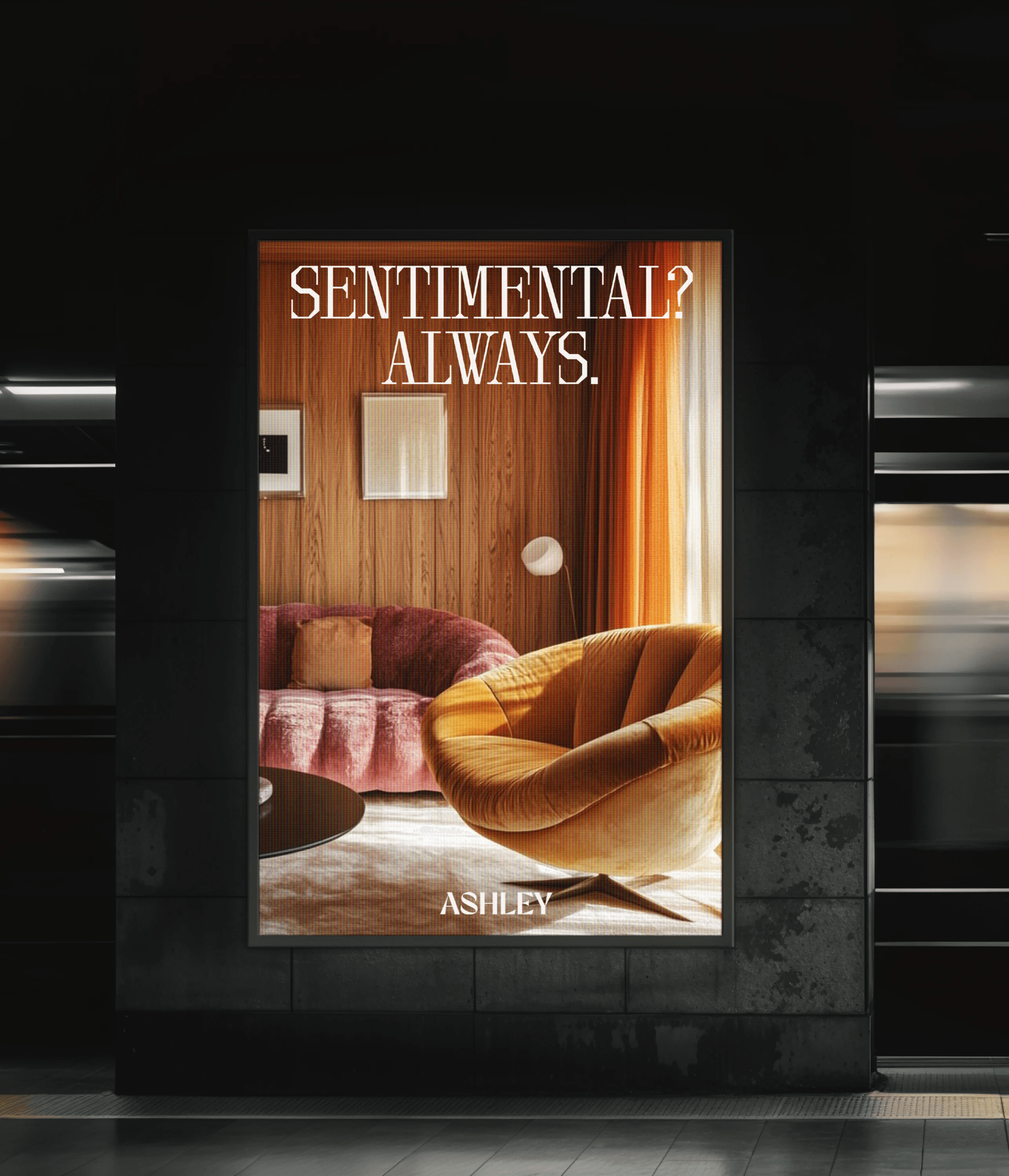
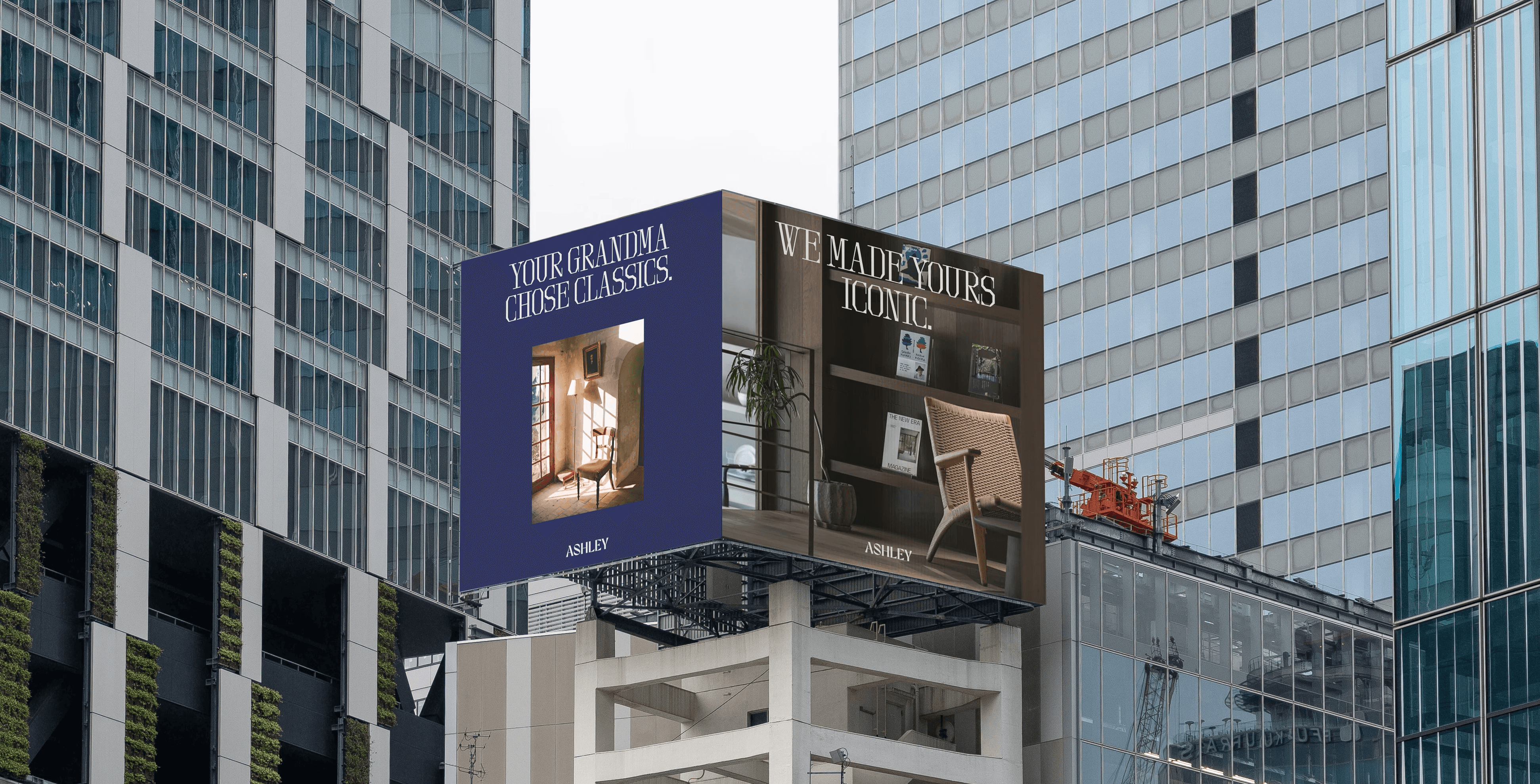
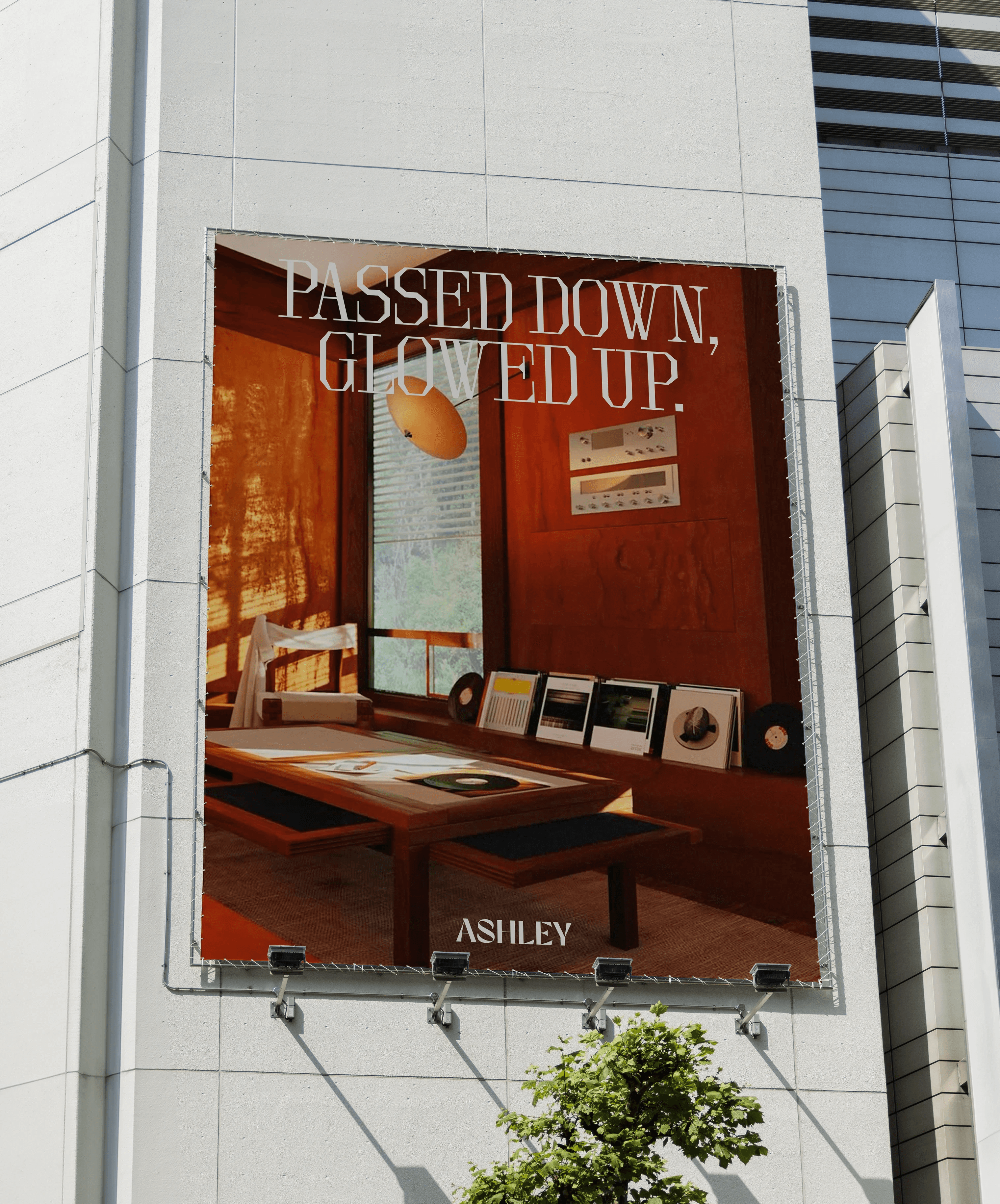
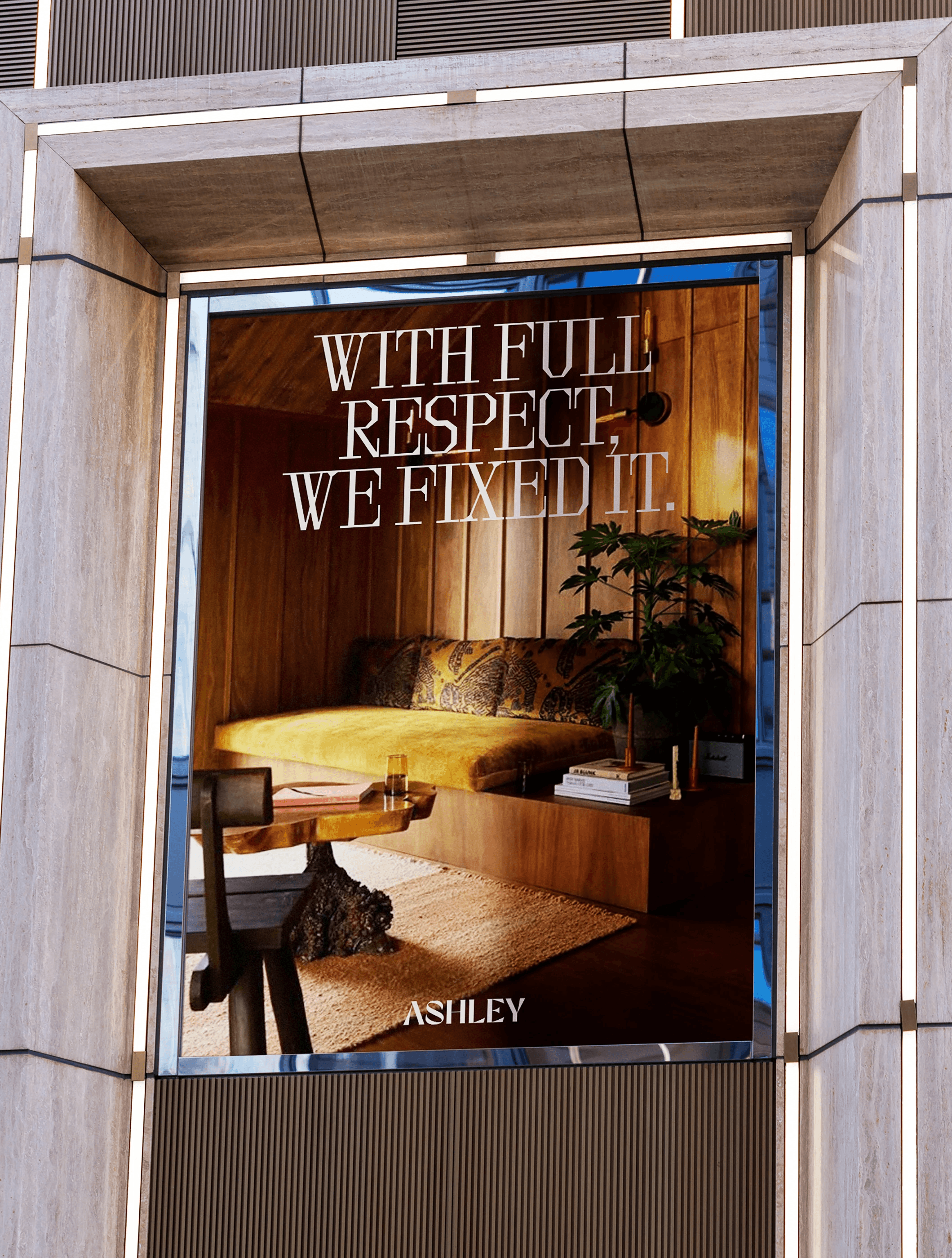
/OOH-CAMPAIGN:
/OOH-CAMPAIGN:
/OOH-CAMPAIGN:
OOH placements read like letters in public — bold statements printed across subway posters, corner billboards, and design magazines. Lines like “Same bones. New attitude.” carried punch and poetry — set in a modernized American typewriter face that felt both sharp and editorial.
OOH placements read like letters in public — bold statements printed across subway posters, corner billboards, and design magazines. Lines like “Same bones. New attitude.” carried punch and poetry — set in a modernized American typewriter face that felt both sharp and editorial.
OOH placements read like letters in public — bold statements printed across subway posters, corner billboards, and design magazines. Lines like “Same bones. New attitude.” carried punch and poetry — set in a modernized American typewriter face that felt both sharp and editorial.


>>MANIFESTO:
>>MANIFESTO:
>>MANIFESTO:
<<snippet>>
They say home is where the heart is.
Well, grandma’s house had plenty of heart… and way too many lace doilies.
<<snippet>>
They say home is where the heart is.
Well, grandma’s house had plenty of heart… and way too many lace doilies.
<<snippet>>
They say home is where the heart is.
Well, grandma’s house had plenty of heart… and way too many lace doilies.

<<snippet>>
Ashley used to be all about that—safe, sturdy, stuck in the past.
But we’re not here to live in a time capsule.
<<snippet>>
Ashley used to be all about that—safe, sturdy, stuck in the past.
But we’re not here to live in a time capsule.
<<snippet>>
Ashley used to be all about that—safe, sturdy, stuck in the past.
But we’re not here to live in a time capsule.
.
<<snippet>>
Same bones. New attitude.
Respectfully, yours.
<<snippet>>
Same bones. New attitude.
Respectfully, yours.
<<snippet>>
Same bones. New attitude.
Respectfully, yours.

/THANK-YOU:
/THANK-YOU:
/THANK-YOU:
<<credits>>
Typeface: OT Brut
Imagery: Pinterest
<<personal note>>
This campaign taught me how to honor where a brand came from and help it step into who it's meant to be next. It let me say goodbye - not just to Ashley's old image, but - to the way we romanticize what no longer fits.
<<credits>>
Typeface: OT Brut
Imagery: Pinterest
<<personal note>>
This campaign taught me how to honor where a brand came from and help it step into who it's meant to be next. It let me say goodbye - not just to Ashley's old image, but - to the way we romanticize what no longer fits.
<<credits>>
Typeface: OT Brut
Imagery: Pinterest
<<personal note>>
This campaign taught me how to honor where a brand came from and help it step into who it's meant to be next. It let me say goodbye - not just to Ashley's old image, but - to the way we romanticize what no longer fits.
/EXPLORE-MORE:
/EXPLORE-MORE:
/EXPLORE-MORE:
<<spin-off>> FORMS & FEELS 📕 >>coming soon<<
<<spin-off>> FORMS & FEELS 📕 >>coming soon<<
<<spin-off>> FORMS & FEELS 📕 >>coming soon<<